GUIDE
How to make a type beat video
On YouTube, a type beat without a video simply does not exist — the platform only indexes videos. The visual is not decoration, it is the entry format. Here is how to get it right, by hand or automatically.
CONTENTS
THE ESSENTIALS
- The thumbnail does the first filtering, the title the second: listening only comes third.
- 1920×1080, 24 or 30 frames per second, the exact length of the beat. Everything beyond that is encoding time you will not get back.
- What decides sharpness after re-encoding is bitrate, not resolution — and a calm background comes out sharper than a spectacular one.
- Plan the 9:16 version from the start: you do not crop a 16:9, you recompose it.
01Why the visual decides everything on YouTube
A beat buyer scrolls a results page. They do not read full titles: they see a thumbnail, an artist name, a duration. The thumbnail does the first filtering, the title the second, and listening only comes third. A great beat with a sloppy visual loses to a decent beat that is well presented — not because YouTube favours the latter, but because nobody clicks the former.
The second effect is watch time. YouTube measures how long people stay, and a still image for three minutes holds attention worse than something that moves. This is not about spectacular effects: slight motion, a clean loop and readable text are enough.
02The three background types that work
1. Cover art
The simplest and safest: your artwork, optionally animated with a very slow zoom or a grain pass. Ideal when you have a strong visual direction and want your catalog to be recognisable. It is also the only option where you own every right without thinking about it.
2. Stock footage
Filmed shots — night streets, neon, roads, smoke — picked to match the mood of the beat. Free stock libraries provide far more than you need. Watch out for one trap: busy footage crushes your text and makes the thumbnail unreadable. Look for shots with a calm area where the title can sit.
3. Music video clips
This is the best-performing format for type beats, because it signals the direction instantly — 'this beat sounds like that artist'. It is also the riskiest legally: reusing footage from a music video belongs to the rights holder, and you expose yourself to a claim or a block. If you go this way, keep excerpts short, accept the risk knowingly, and do not build your entire catalog on it.
03Where to find visuals you are allowed to use
This is where catalogs get built on sand. A background found in three clicks and reused across forty videos becomes, if it turns out to be a problem, a problem on forty videos. So the checking happens once, at the moment you choose the background, and not at the moment of the claim.
"Free" and "royalty-free" are not the same thing
Free describes the price, royalty-free describes the usage — and the two cross into all four possible combinations. A clip you can download without paying may still require crediting the author, forbid commercial use, or forbid precisely what you are doing with it: embedding it in a work you resell. And a type beat video with a purchase link in the description is commercial use, including when the beat is advertised as free.
So read the licence of the clip, not the homepage of the site. And keep a copy of it: what protects you is not having had the right, it is being able to show that you had it, on a site whose terms may have changed since.
The case of generated imagery
Generating your visual settles the question of provenance but not the question of resemblance: an image reproducing a real person’s features, or a brand’s visual identity, remains challengeable on grounds other than copyright. And commercial-use terms differ from one generator to the next — that is the first thing to check if the visual is going to accompany a beat that is for sale.
The real advantage of this route lies elsewhere, and it is considerable: you get a coherent art direction across an entire catalog, which cherry-picking unrelated stock clips never gives you.
04The settings that actually matter
| Setting | Target | Why |
|---|---|---|
| Resolution | 1920×1080 | Beyond that you multiply encoding time with no visible gain on a 300px thumbnail. |
| Aspect ratio | 16:9, plus a 9:16 | Vertical is planned from the start for TikTok and Shorts, not bolted on afterwards (see below). |
| Frame rate | 24 or 30 | 60fps adds nothing to a slow-moving background and doubles the file size. |
| Duration | the length of the beat | No more, no less: ten seconds of black at the end wrecks retention. |
| Audio | AAC 320 kbps | Platforms normalise playback volume: crushing your master to "sound louder" will not make it come out louder, it will only cost it its dynamics. |
| Looping | seam checked | On a short repeated background, a visible cut every five seconds is the detail that reads as amateur. |
Looping the background without a visible seam
A few seconds of footage repeated across three minutes is the norm, and the seam is what gives away rushed work. Two methods work: pick a shot whose start and end already resemble each other (smoke, rain, a pulsing neon), or cut it as a round trip — normal playback then reversed playback. The second only works on movement with no readable direction: on a car driving forward, the reverse is glaring.
Test it in real conditions, not in the editor: export, then watch the whole video once without touching the scrubber. A seam you do not notice after three minutes is a seam that works; if it annoys you on the second loop, it will annoy a listener on the first.
Movement that holds attention without stealing it
The job of movement is not to tell a story, it is to stop the image looking frozen. A very slow zoom on a still image, an animated grain, a slight drift are enough — and cost far less time than effects. The useful rule: if the movement draws the eye to the point where you watch the movement itself, it is too strong. It should be noticed by its absence, not its presence.
05Encoding: what is lost between your export and the screen
No platform serves the file you send. They all re-encode it into their own formats, at several qualities, so it can be adapted to each viewer’s connection. What you upload is therefore not what will be seen: it is the raw material the watched version is built from. That distinction explains most playback disappointments.
Why your video looks softer online
Two causes stack up. The first is progressive processing: right after publishing, only a low-quality version exists, and the higher ones arrive afterwards — judging your video in the minutes following upload makes no sense. The second is the re-encode itself, which struggles with anything moving everywhere at once: heavy grain, rain, snow or smoke blur eat enormous amounts of bitrate and come back as blocks.
The consequence is counter-intuitive: a visually calm background often comes out sharper than a spectacular one. If you want grain, keep it light — an effect you like on your export can be exactly what destroys the image after re-encoding.
Bitrate, and why raising the resolution fixes nothing
The usual reflex when the image degrades is to export bigger. That is rarely the answer: what decides encoding sharpness is bitrate — the amount of data per second — not the pixel count. A 1920×1080 image at a comfortable bitrate comes out better than a larger one strangled by a low bitrate, and costs far less export time.
So export H.264, at 1920×1080, with a generous bitrate: the heavy file you send will never be served as-is anyway, it only exists to give the re-encode clean material to work from. It is the one point in the process where being too generous costs nothing but upload time.
06The thumbnail is the real lever
Design it for 300 pixels wide, not for your monitor. Three elements maximum: the reference artist's name, large; the beat title; your producer tag. Strong contrast, heavy typeface, and no sentences. If you have to squint at actual size, it has failed.
Keep one visual constant across the whole catalog — same typeface, same text position, same colour treatment. A producer who is recognisable at a glance in a results page earns clicks the content alone would not have won.
07Title, description and tags
The convention is stable and there is no upside in deviating from it: '[FREE] Artist Type Beat - Title'. That is exactly what people type. Add BPM and key in the title or at the top of the description — many buyers filter on those.
In the description, put the useful information first — usage terms, purchase link, BPM, key, contact — because only the first two lines are visible without expanding. Tags play a minor role today, but stay consistent: artist name, 'type beat', genre, BPM.
08Cutting a 9:16 version for TikTok and Shorts
Do not crop your 16:9: you lose the subject and the text. Rebuild from the same background in a vertical frame, keep a 15 to 30 second excerpt centred on the best moment of the beat (usually the drop, rarely the intro), and move the text into the upper third — TikTok's interface covers the bottom of the screen.
09How long it takes, and what to automate
Done by hand, budget 20 to 40 minutes per track: find the visual, edit, export, build the thumbnail, then retype title, description and tags on each platform. Across fifteen releases a month that is close to a full week of work — spent not making music.
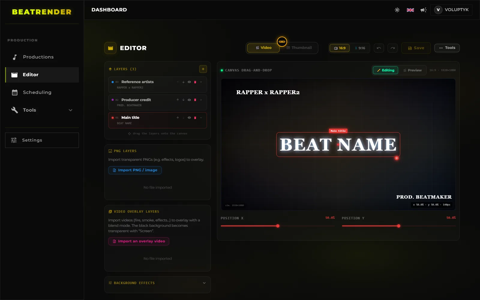
The creative part — choosing the style, the visual direction — deserves your time. The rest is repetitive execution: apply a template, encode, resize, fill in fields. That is exactly what a tool does better, and without getting bored.
- 1Design the style onceBackground, overlays, typeface, title position, producer credit: these are the only genuinely creative decisions in the batch.
- 2Drop the beats in batchesThe gain does not come from a faster upload, it comes from changing your unit of work: the batch rather than the track.
- 3Let it buildVideo, thumbnail, title, description and tags are produced for each one from the same template — so they agree with each other by construction.
- 4Review, schedule, go back to producingReviewing stays yours: a badly set template produces the same mistake across the whole batch instead of once.
10The mistakes that come up most often
- A thumbnail that is unreadable when small — the number one mistake, and the most expensive.
- A different visual every release: no identity gets built and your audience never recognises you.
- A title without the reference artist name: nobody can find you.
- A badly seamed background loop, visible every few seconds.
- No vertical version, therefore no discovery outside YouTube.
- A master crushed to "sound loud" when the platform renormalises anyway.
READ NEXT
- 10 MIN READHow to publish beats to BeatStars automaticallyPrepare your files, fill in the metadata that sells, handle licences and cover art, publish in batches and sync with YouTube and TikTok.
- 12 MIN READWhere to sell your beats: BeatStars, Airbit, TrakTrain or your own storeCommissions, payouts, licences and lock-in: what actually separates BeatStars, Airbit, TrakTrain and your own store — plus the maths that settles it.
- 10 MIN READHow to upload beats to YouTube in bulkPrepare a batch, upload several beats at once, schedule releases to the hour and keep metadata consistent across an entire catalog.
- 11 MIN READHow to upload beats: what to settle before you clickAudio format, loudness, cover art, metadata, rights and samples: everything to settle before you upload a beat, on any platform.
- 9 MIN READTitle, description and tag templatesOne title template, one description block and a reusable tag list for every release — plus the method that stops you rewriting them on every upload.
- 12 MIN READPromoting your beats on TikTok and YouTube ShortsWhere to cut the thirty seconds, which export settings, what to write in the caption and where the buy link really lives: short-form for beatmakers.
- 17 MIN READBuilding a type beat YouTube channelLane, channel identity, playlists, thumbnails, Shorts, revenue and analytics: how to build a type beat YouTube channel that still runs a year from now.
- 15 MIN READBeat licensing and pricing: what you actually sellMP3, WAV, trackout, unlimited, exclusive: what each tier really allows, how to set your prices, and what the contract has to say in plain words.
- 14 MIN READSplitting a beat between producersWho owns what when a beat is co-produced: usual splits, BeatStars payouts, YouTube revenue, samples, and the written agreement that prevents a dispute.
- 16 MIN READHow often should you upload type beatsHow often to release, how to build a buffer of finished beats, where to place your slots, and how to restart a channel after a gap without wrecking it.
- 12 MIN READHow to promote your BeatStars beats on YouTubeWhere the buy link goes, what belongs in the two visible lines of a description, what the pinned comment is for, and how to find out which video actually sold.
- 14 MIN READConnecting your accounts to an upload toolPassword, OAuth or browser extension: what an upload tool really gets on your accounts, what it cannot do, and how to take the access back.
- 18 MIN READHow to make a type beat thumbnail that gets clicksDesign for the phone tile, three elements and never four, what the artist photo costs, and the one number that tells you whether a thumbnail works.